Olympic Dreams: Create Inspiring Spaces with Colours
As we immerse ourselves in the Paris Olympic Games, the passion and dedication of the athletes are truly inspiring. Alongside the thrilling competitions, I find myself fascinated by the vibrant colours of the flags and the Olympic rings. These colours not only enhance the visual spectacle but also carry deep meanings and symbolism that can inspire our interior design projects.
Colours have the power to evoke emotions, convey messages, and shape our perceptions. But what’s the meaning behind the Olympic logo’s colour choices, and how can we draw inspiration from them for our interior designs?
Olympic Rings
The Olympic logo, known as the Olympic rings, and its colours have a rich history that is closely tied to the values and ideals of the modern Olympic Games.
They were designed by Pierre de Coubertin, the founder of the modern Olympic Games, in 1913. The rings are five interlocking circles, which represent the five inhabited continents of the world: Africa, the Americas, Asia, Europe, and Oceania. The interlocking nature of the rings symbolizes the unity and friendship of the athletes from around the world who participate in the Olympic Games.
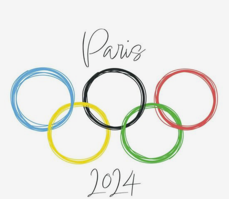
Colours of the Rings
The colours of the rings are blue, yellow, black, green, and red, set on a white background.
According to Coubertin, the colours of the rings, along with the white background, represented the colours of every competing country's flag at the time. This inclusiveness reflects the international spirit of the Olympics.
The Olympic rings first appeared publicly in 1914 at the Olympic Congress in Paris, but the first time they were used at the Olympic Games was in the 1920 Summer Olympics in Antwerp, Belgium. Since then, the logo has remained largely unchanged and has become one of the most recognizable symbols in the world.
Symbolism and Values
The logo and its colours symbolize the ideals of Olympism, which include bringing together athletes from all over the world, promoting peace and understanding, and celebrating humanity's physical and cultural diversity through sport. The logo is a powerful representation of the Olympic movement's mission to build a better, more peaceful world through sportsmanship and international cooperation.
How to be inspired?
The Olympic ring’s colours are bold, strong and bright and can create dynamic, engaging, and visually appealing spaces. The trick is to balance them with neutrals to prevent the space from feeling too busy or overwhelming.
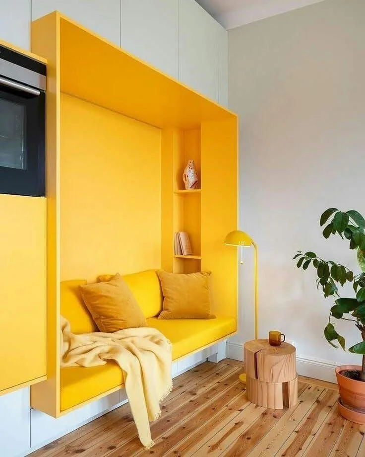
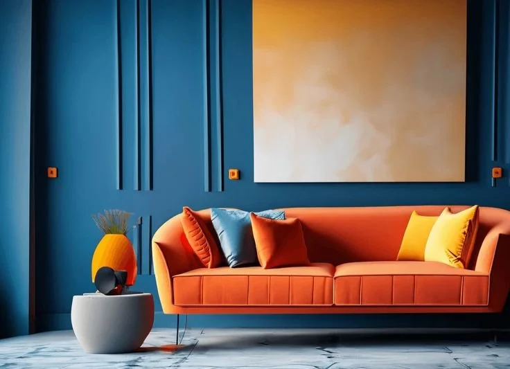
Bold colours can be used to design accent walls: choose one wall in a room to paint in a bold colour while keeping the other walls neutral, this can create a focal point and add depth to the space.

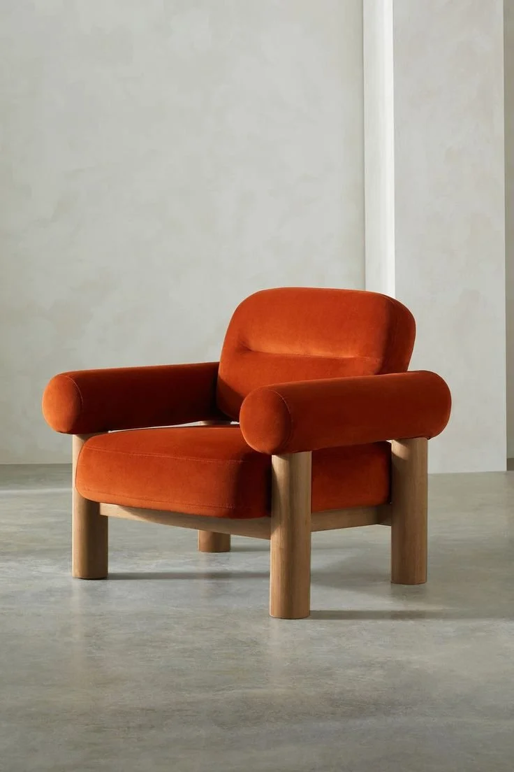
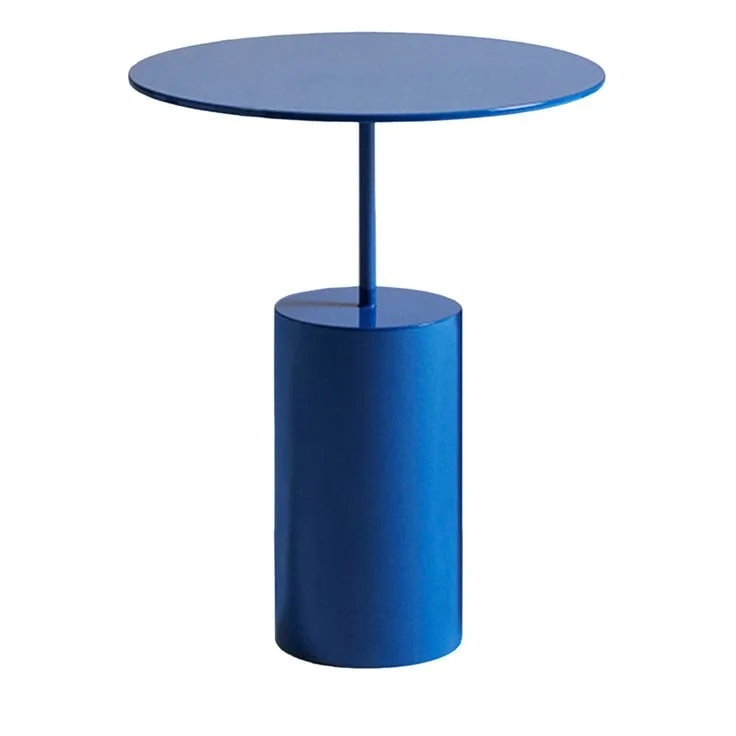
Bold-coloured furniture can act as a statement piece in a room, but choose a colour that you love! Incorporate a brightly coloured sofa, armchair, or table balancing it with neutral or softer tones in the rest of the room to avoid clashing.
Accessories are a flexible way to add bold colours and can be easily changed. Pillows, throws, rugs, vases, and artwork in bold colours can add pops of colour throughout the room.


Another way to use bold colours is colour blocking, which involves using large blocks of bold colours in different parts of a room. To design with colour blocking choose two or three bold colours and apply them in different sections or pieces in the room. Keep the patterns simple and geometric. A good combination could be bold blue and green blocks on different sections of a wall for example or a room with one wall painted in a bold colour and furniture in another bold colour.
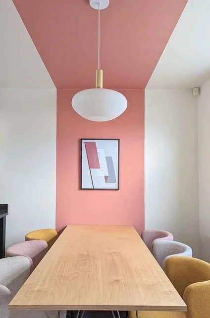
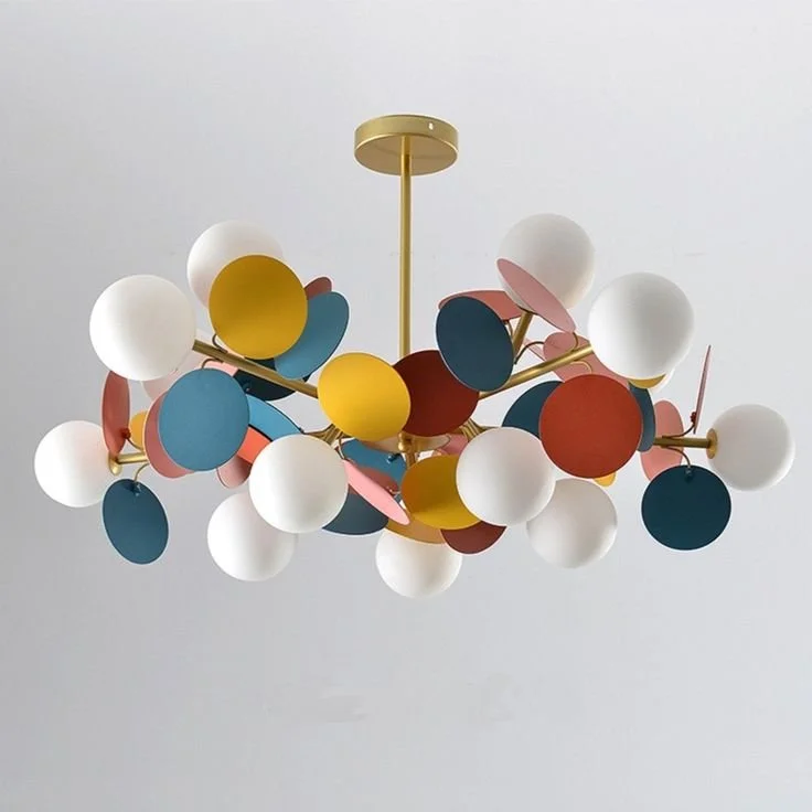
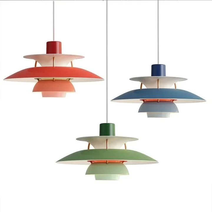
Lighting can be also a good way to introduce a bold colour. A lamp, chandelier or pendant in bold hues can complement and give an unexpected effect to the room’s colour scheme.
Tips for Success
Balance: Always balance bold colours with neutrals to prevent the space from feeling too busy or overwhelming.
Test First: Use sample paints and fabrics to see how bold colours look in the actual lighting of your space before committing.
Cohesion: Ensure that the bold colours you choose complement the overall style and palette of your home.
Accent: Use bold colours as accents to highlight architectural features or special pieces of furniture.
By carefully incorporating bold colours using these strategies, you can create vibrant, lively, and aesthetically pleasing interiors that reflect your personal style and make a strong design statement.
Need help with your bold colours scheme?
Get in touch today and we'll be happy to add a splash of colour to your space!